
In the Lower Omo Valley in Ethiopia, a food security crisis is unfolding. According to the Famine Early Warning Systems Network (FEWSNET), the situation in the area has passed ‘stressed’ to reach the ‘crisis’ stage. Against this background, a few affected agro-pastoralists are mapping the natural resources they have access to, as part of an effort to better manage their resources and provide evidence to assess the scale of the disaster.
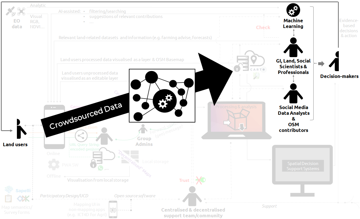
This blogpost briefly describes the context, the socio-technical approach that is used for supporting affected people in mapping the crisis, and the data. We explain the four main stages of the process: Engagement & Co-Design; Mapping; Information Sharing; and Data-Driven Collaboration.
This blogpost will not provide a detailed description of the problems that the people in the Lower Omo face (or their causes). The most pressing interconnected issues are water inaccessibility, food insecurity and conflict. The main causes are drought – which has exacerbated due to climate change – and the negative impacts of dam construction on flood recession agriculture. For more information, see the publications of the Omo-Turkana Research Network and Locacons.
Engagement & Co-Design
During the engagement & co-design process, once the issues faced and the potential benefits and risks of the mapping activities are identified and discussed with the communities, the technology is customised following human-centred design principles. Based on the discussions held around the question ‘What do you want to map?’, the map semantics interface (i.e. the map meaning and legend) of a Sapelli mapping app for rangelands environments is co-designed with the people engaged. These interfaces include both captions and pictograms, overcoming possible barriers from the level of education and literacy.
Mapping
In terms of the mapping technique, both the GPS-based and the satellite imagery-based functionalities are activated in the app to allow people to map while on-site but especially while off-site, so the mapping can also take place where people gather, share, connect to the internet and charge the smartphones.

Information Sharing
The question that follows the map creation-related discussions is ‘Whom do you want to share the data with?’ Based on the answers of community members but also other stakeholders such as government officials working in the agriculture and peace and security sectors, an appropriate socio-technical solution is implemented for both private and open data sharing.
Linking messaging & mapping can make the system useful, sustainable and highly scalable. As a demonstration of this potential, the map contributions are currently being shared directly through WhatsApp. In a complex and challenging environment like the Lower Omo Valley, open mapping must be approached carefully and incrementally, therefore it is not appropriate to release all the data by default. Private mapping is done first, with participants active decision to share the information.

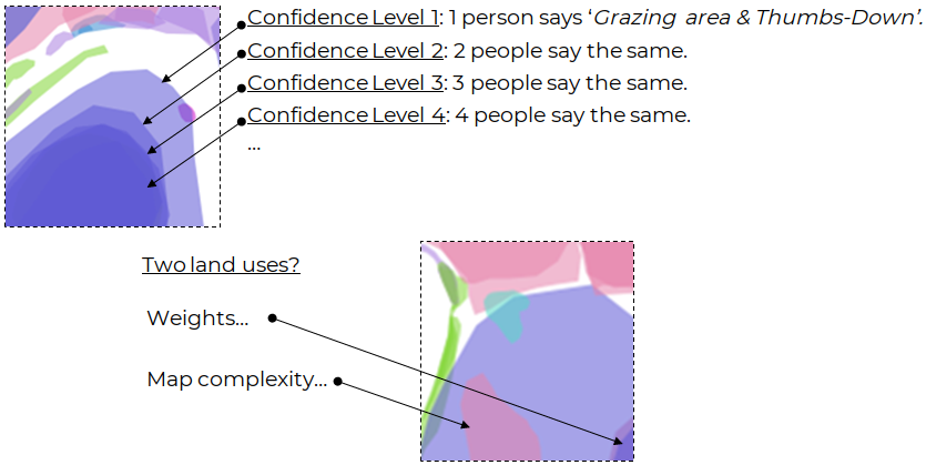
Since the mapping started in September 2021, 1600+ map contributions have been shared in the WhatsApp group. Most of the natural resources’ state is mapped as ‘Thumbs Down’, with ponds the most mapped and affected resource, both for farming (28%) and for animal watering (20%).

As in most crowdsourcing projects, the participation inequality phenomenon applies, which is the phenomenon that a small percentage of participants contribute a high percentage of the total information (see Haklay, 2016). Here, eight participants were engaged initially, but most of the contributions are being created by two participants. Participants are not being paid, but we provided smartphones and solar chargers/power banks, and data bundles are provided on a monthly basis to all participants. Currently, the prototype is password protected, and its implementation will be scaled-up – as per the government officials’ request – when conditions allow. This is an ongoing pilot project.
Data-Driven Collaboration

How accurate is the dynamic land use and crisis map? The answer is that it depends – As Mike McCall points out, we need to ask: Precision for Whom? (see McCall, 2006). One of the many questions that emerges is ‘How can we quantify the accuracy of a polygon that aims to represent the fuzzy and dynamic boundaries of a grazing and/or hunting area?’ One short answer is that this can’t be done without acknowledging both the potential and the fundamental limitations of machines to learn how to process digital geographic information that aims to represent local land knowledge. What stakeholders (in-the-loop) can do is to put appropriate validation mechanisms in place to discard ‘clearly wrong’ and inappropriate geometries and then quantify precision where needed. For instance, if many local people classify a piece of land as ‘grazing area’, then the chances that this piece of land (or a group of pixels) is used for grazing is higher than if fewer local people classify it similarly or differently. See the validity of Linus’ law to crowdsourced geographic information in Haklay et al. (2013). In short, the more map contributions, the better the map.
An in-depth spatial analysis of the crowdsourced data has not been conducted yet. This blogpost is a call for collaboration, and a data-driven collaboration framework is proposed and introduced below. A detailed description of the full diagram below is available in the second part of this blogpost (link here).
Marcos
Collaborators: Jed Stevenson (Lead Researcher) and Dessalegn Teckle (Research Assistant-Field Officer). The community members, whose names are not disclosed. Muki Haklay. Claire Ellul, Judy Barrett, Jerome Lewis and the ExCiteS & Mapping for Change group. The Locacons and SIDERA project members, Benedikt Kamski and Will Hurd.
Acknowledgements: We want to thank the European Research Council and FORMAS for the research funding, and CARTO, the European Space Agency, Planet and Sinergise for providing free access to cloud services and satellite imagery.

8 Comments